The Anatomy of a Liquid Glass Button: WebGL, CSS, and 6 Layers of Chrome
Key Takeaways
- This liquid glass button uses a real-time WebGL shader to generate an animated chromatic border, not a GIF or video loop
- The button is built from 6 stacked layers: glass shell, metallic border, chrome bevel, inner pill, text, and hover state
- On hover, the inner surface inverts from white to dark over 0.8 seconds while the chrome border keeps spinning without interruption
- The full button weighs about 190KB of JavaScript, smaller than a single hero image, and runs on the GPU without blocking page rendering
Live demo above. Hover over the button to see the 0.8s inversion. The chromatic border is rendering in real-time via WebGL.
This liquid glass button uses a WebGL shader running in real-time to produce that animated chromatic border. The metallic highlights orbit the perimeter, shifting through spectral colors as they move. On hover, the inner surface inverts from light to dark while the chrome ring keeps spinning without interruption.
This isn’t a CSS gradient trick or a pre-rendered animation. It’s a live shader rendering metallic reflections frame by frame, masked to a pill shape, and rotated with CSS. The effect is subtle enough to feel natural on a navigation bar but detailed enough to catch your eye when you look closely.
What the Liquid Glass Button Does on Hover
The button sits inside a frosted glass navigation bar with a soft backdrop blur. The background has subtle color gradients so the frosted glass has something to refract. This gives the entire nav area depth before you even get to the button.
In the default state, the inner surface is a clean off-white with dark text. The chrome border orbits quietly. On hover, the inner surface fades to near-black over 0.8 seconds, the text flips to white, and the chrome border becomes more prominent against the dark background.
The transition feels deliberate, like a physical toggle. Press and hold, and it darkens further. Release, and it returns. The chrome border never stops, never reverses direction, and never glitches during any of these transitions. That continuity is what makes it feel polished rather than tacked-on.
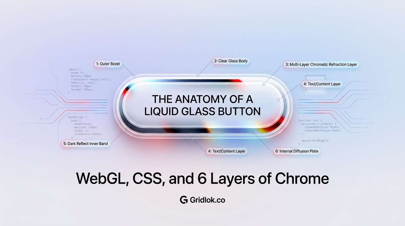
The Layer Stack: 6 Pieces of Glass
The button isn’t one element with a fancy border. It’s six layers stacked on top of each other, each responsible for a single visual job.
Layer 6 (top)    Text             "Gridlok.co" label
Layer 5          Inner Pill        White/dark surface (hover inverts)
Layer 4          Chrome Bevel      Thin silver highlight ring
Layer 3          Metallic Border   WebGL shader canvas (rotating)
Layer 2          Glass Shell       Neumorphic outer frame
Layer 1 (bottom) Glass Nav Bar     Frosted backdrop-filter container
The glass shell creates the outer frame with gradient lighting and soft shadows that simulate a 3D edge. The metallic border sits inside it, clipped to a pill shape, showing about 4 pixels of animated chrome.
The chrome bevel adds a thin bright ring between the border and the inner surface. The inner pill covers the center with a solid background. And the text floats on top of everything.
Every layer has its own z-index, its own border-radius, and its own set of shadows. This separation means each element can animate independently. The inner pill can fade from white to black without affecting the chrome border. The chrome border can rotate without disturbing the glass shell.
How the Chromatic Border Works
The animated chrome effect comes from a custom WebGL shader we call MetallicPaint. It renders a liquid metallic texture onto a canvas, complete with chromatic aberration (the color-splitting effect you see in real chrome reflections).
The shader calculates multiple layers of wave-based distortion, separates the red, green, and blue color channels slightly, and applies metallic lighting math to simulate how light bounces off curved metal surfaces. It runs at 60 frames per second on the GPU.
Here’s the trick that makes the highlights orbit the border: the shader itself barely moves. Its internal animation speed is set to nearly zero. Instead, the entire WebGL canvas is rotated using a CSS animation, one full revolution every 7 seconds.
The result is that the metallic texture stays rich and detailed (because the shader handles the quality) while the motion stays smooth and circular (because CSS handles the rotation). Trying to do the orbital motion inside the shader would produce a linear sweep instead of the ring-chase effect you see in the demo above.
The Frosted Glass Nav Bar
The button doesn’t exist in isolation. It sits inside a frosted glass nav bar that uses backdrop-filter: blur(24px) to create depth against the page background.
This is a detail that gets skipped in most glass-effect implementations. A frosted glass element over a solid white background just looks like a white rectangle with a border. The background needs texture, color variation, or depth for the glass to read as glass.
The soft gradient blobs in the page background are invisible on their own but become the entire point when they’re refracted through the nav bar. It’s the kind of detail that takes 10 minutes to add but makes the effect feel complete rather than half-finished.
Why This Level of Detail Matters for Your Website
A standard button takes about 30 seconds to implement. This button took a full afternoon of tuning across the shader parameters, layer sizing, shadow values, hover timing, and glass nav integration, built with the help of Claude Code as a pair-programming partner.
That ratio sounds absurd until you consider what the button communicates. When a visitor lands on a site with this kind of micro-detail, they don’t consciously think “that’s a WebGL shader with chromatic aberration.” They think “this feels expensive.” That perception transfers directly to the brand.
Template sites can’t do this. Drag-and-drop builders can’t do this. AI website generators can’t do this (not yet, anyway). This kind of work requires someone who understands shaders, layered CSS architecture, and performance optimization, and who has the patience to tune 20+ parameters until the effect feels right rather than just looks right.
The gap between “looks professional” and “feels premium” is exactly where custom work like this lives. Most sites clear the first bar. Very few clear the second. If you’re a business where perception of quality matters (and that’s most businesses), the details that separate your site from a template are the ones visitors can’t articulate but absolutely notice.
Technical Specs
The button runs on React with a raw WebGL2 shader. No Three.js dependency for the button itself. It works in all modern browsers that support WebGL2: Chrome, Firefox, Safari, and Edge on both desktop and mobile.
Performance is reasonable. The shader runs on the GPU, so it doesn’t block the main thread or affect page interactivity. On mid-range hardware, it adds about 2-3ms per frame. On older devices, the CSS rotation can be reduced or the shader can be swapped for a static metallic image fallback.
The full button weighs about 190KB of JavaScript (including React), comparable to a single hero image. The WebGL canvas renders at 800×800 pixels internally but is CSS-scaled and clipped to the button dimensions. Every parameter is configurable: tint color, brightness, contrast, chromatic spread, rotation speed, wave amplitude, border thickness.
Get the Code
The button is built from four files. Copy them into any React project and you’ll have the working effect. The MetallicPaint shader is the only dependency beyond React itself. The full shader source is included below.
GlassNavButton.jsx
import MetallicPaint from './MetallicPaint';
import './GlassNavButton.css';

export default function GlassNavButton({ children = 'Button', onClick }) {
  return (
    <button className="glass-nav-btn" onClick={onClick}>
      <div className="glass-shell" />
      <div className="metallic-border">
        <MetallicPaint
          imageSrc="/pill-border.svg"
          seed={42}
          scale={4}
          patternSharpness={1}
          noiseScale={0.5}
          speed={0.05}
          liquid={0.75}
          mouseAnimation={false}
          brightness={1.1}
          contrast={1.1}
          refraction={0.025}
          blur={0.008}
          chromaticSpread={6}
          fresnel={1.8}
          angle={0}
          waveAmplitude={1.4}
          distortion={1.5}
          contour={0.4}
          lightColor="#ffffff"
          darkColor="#000000"
          tintColor="#feb3ff"
        />
      </div>
      <div className="inner-bevel" />
      <div className="inner-pill">
        <span className="btn-text">{children}</span>
      </div>
    </button>
  );
}
GlassNavButton.css
.glass-nav-btn {
  position: relative;
  width: 240px;
  height: 64px;
  border: none;
  background: transparent;
  cursor: pointer;
  padding: 0;
  border-radius: 32px;
  outline: none;
}

.glass-shell {
  position: absolute;
  inset: -3px;
  border-radius: 35px;
  background: linear-gradient(
    180deg,
    rgba(255,255,255,0.92) 0%,
    rgba(240,240,245,0.7) 40%,
    rgba(220,220,228,0.6) 100%
  );
  border: 1px solid rgba(255,255,255,0.85);
  box-shadow:
    0 4px 20px rgba(0,0,0,0.10),
    0 1px 4px rgba(0,0,0,0.06),
    inset 0 2px 0 rgba(255,255,255,1),
    inset 0 -1px 3px rgba(0,0,0,0.04);
  z-index: 0;
  pointer-events: none;
}

.metallic-border {
  position: absolute;
  inset: 0;
  border-radius: 32px;
  overflow: hidden;
  z-index: 1;
}

.metallic-border .paint-container {
  position: absolute !important;
  top: 50% !important;
  left: 50% !important;
  width: 500px !important;
  height: 500px !important;
  margin: -250px 0 0 -250px !important;
  border-radius: 50% !important;
  animation: orbit 7s linear infinite !important;
}

@keyframes orbit {
  0% { transform: rotate(0deg); }
  100% { transform: rotate(360deg); }
}

.inner-bevel {
  position: absolute;
  inset: 3px;
  border-radius: 29px;
  border: 1.5px solid rgba(255,255,255,0.75);
  box-shadow:
    inset 0 1px 0 rgba(255,255,255,0.95),
    0 0 3px rgba(0,0,0,0.12);
  z-index: 3;
  pointer-events: none;
  transition: border-color 0.8s ease;
}

.inner-pill {
  position: absolute;
  inset: 4px;
  border-radius: 28px;
  background: #f5f5f7;
  display: flex;
  align-items: center;
  justify-content: center;
  z-index: 2;
  pointer-events: none;
  box-shadow:
    inset 0 1px 0 rgba(255,255,255,0.85),
    inset 0 -1px 2px rgba(0,0,0,0.02);
  transition: background 0.8s ease;
}

.btn-text {
  font-size: 17px;
  font-weight: 600;
  color: #111;
  font-family: -apple-system, 'SF Pro Display', sans-serif;
  transition: color 0.8s ease;
}

.glass-nav-btn:hover .inner-pill { background: #1a1a1e; }
.glass-nav-btn:hover .btn-text { color: #fff; }
.glass-nav-btn:hover .inner-bevel { border-color: rgba(255,255,255,0.25); }
.glass-nav-btn:active .inner-pill { background: #111114; }
pill-border.svg (place in public/)
<svg xmlns="http://www.w3.org/2000/svg" viewBox="0 0 480 480">
  <rect x="8" y="184" width="464" height="112" rx="56" ry="56" fill="black"/>
</svg>
You’ll also need the MetallicPaint shader component. It’s a self-contained WebGL2 shader that renders the metallic texture onto a canvas element. The key implementation details: an 800×800 square canvas (required for clean CSS rotation), a canvasRatioRef for aspect ratio tracking, and a dynamic u_ratio uniform. The full MetallicPaint source is too long to inline here, but the component above shows exactly how to wire it up.
FAQ
Built with React and a custom WebGL2 metallic shader. No Three.js required for the button component.
See what ChatGPT is really searching
SubSeed captures the hidden Google queries ChatGPT runs behind every answer and enriches them with search volume, CPC, and keyword difficulty.
Related Posts
Make Gridlok a Preferred Source on Google
See Gridlok surfaced more often in your Top Stories, AI Overviews, and AI Mode. One click, applied across Google Search.