How to Read an Attention Heatmap (Without Drawing the Wrong Conclusion)
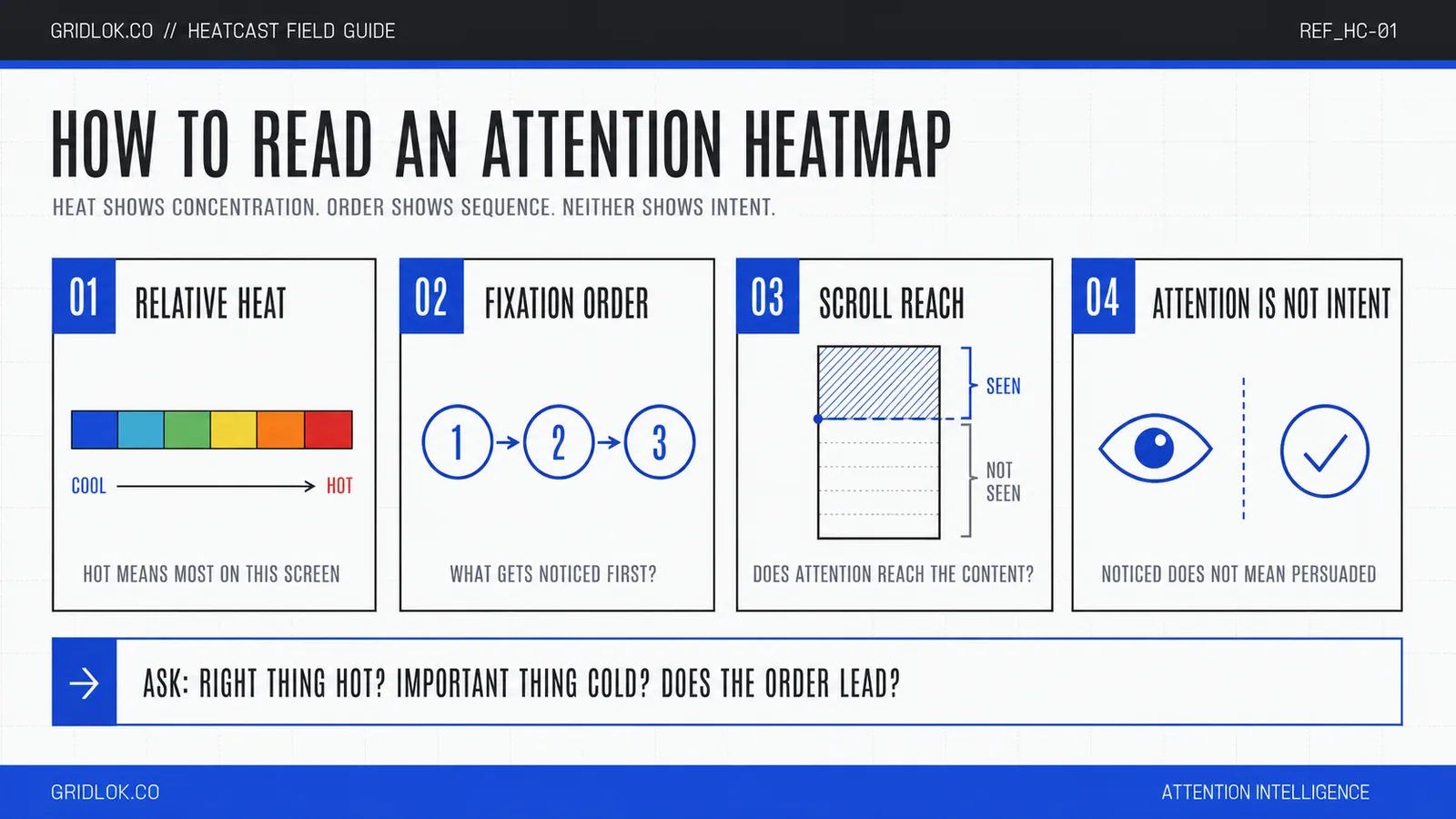
An attention heatmap looks obvious until you actually have to act on one. Warm blobs, cool edges, a few hotspots, and then the real question: so what do I change? This is how to read an attention heatmap without drawing the wrong conclusion from it.
The short version: the colors show where attention is predicted to concentrate, the order matters as much as the heat, and none of it is a promise that anyone will convert. The value is in what the map tells you about your page’s hierarchy.
One distinction up front, because it changes everything about how you read the image. There are two different things people call a heatmap.
Key takeaways
- Warm colors mark where attention is predicted to concentrate. Cool colors mark where it probably won’t. The scale is relative to that one screen, not an absolute score.
- A predicted attention heatmap is a forecast from a model, not a recording of real eyes. That’s a strength and a limit at the same time.
- The scanpath, the order attention is predicted to move in, tells you more than the heat alone. Look at what gets noticed first and what gets skipped.
- Attention isn’t intent. A hot area means noticed, not persuaded. Treat the map as a design question, then confirm anything important with real data.
Which kind of heatmap are you looking at?
A recorded heatmap, the kind tools like Hotjar or Crazy Egg produce, aggregates what real visitors did. Clicks, moves, and scroll positions from actual traffic. It needs a tracking script on your site and enough visitors to be meaningful, and it tells you what already happened.
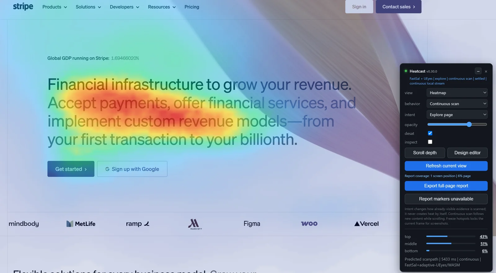
A predicted attention heatmap, the kind the Heatcast extension produces, is a forecast. A model estimates where a first-time viewer’s attention is likely to land, before anyone visits. No tracking script, no traffic, no waiting.
Both are useful, and they answer different questions. Recorded heatmaps tell you what your existing audience did. Predicted heatmaps let you test a page a competitor runs, a design nobody has seen yet, or a draft before it ships. The rest of this guide is about reading the predicted kind.
What the colors actually mean
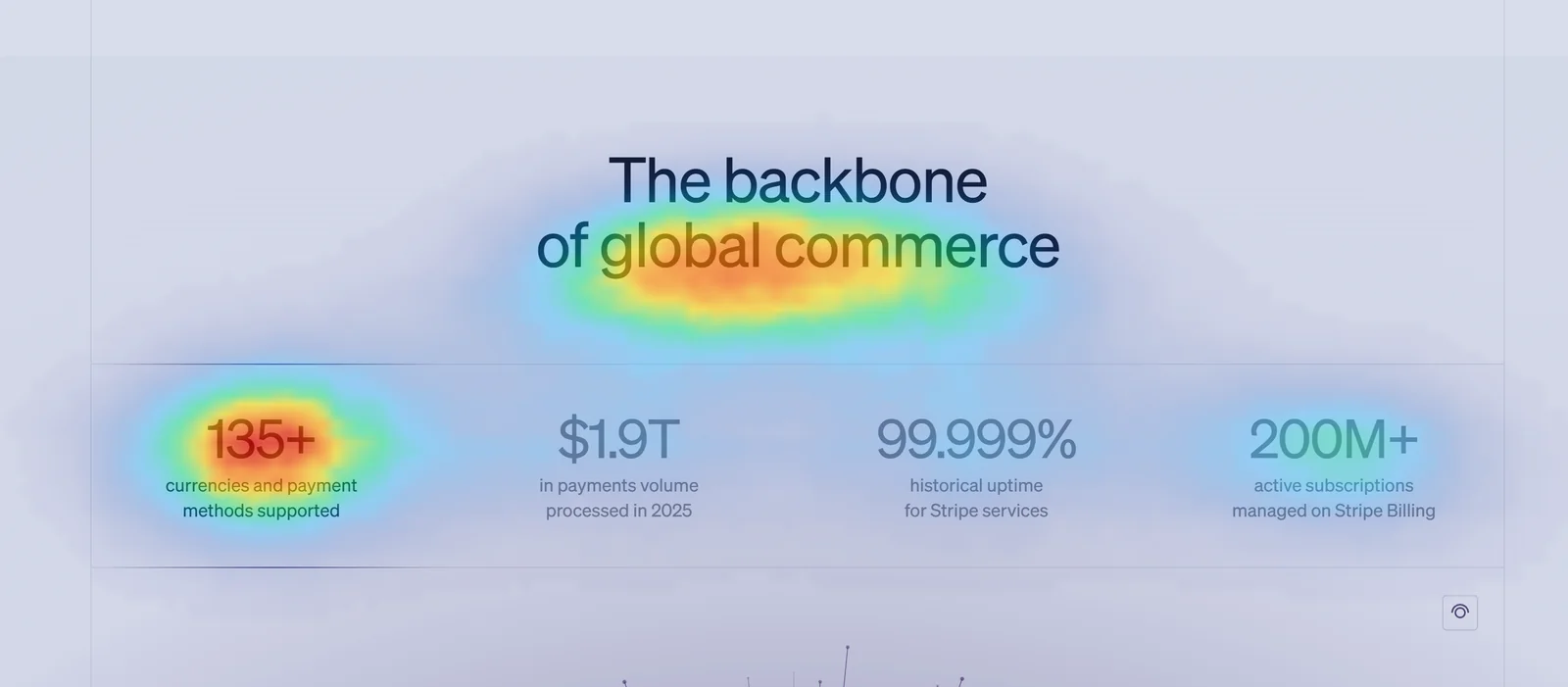
The color scale runs from cool to warm. Blue and green areas are predicted to draw little attention. Yellow, orange, and red areas are predicted to draw the most.
The single most common misreading is treating the colors as absolute. They aren’t. The map is normalized to the screen you’re looking at, so the hottest spot on a calm, sparse page can be far less compelling than a merely warm spot on a busy one. Red means “the most attention on this screen,” not “guaranteed to be seen.”
A good predictive model also accounts for this. If a viewport has almost nothing worth looking at, a well-built tool dims the whole field rather than inventing a red hotspot out of low-level noise. So a mostly cool screen is a real signal, not a broken render. It’s telling you the page gives the eye little to grab.
The order tells you more than the heat
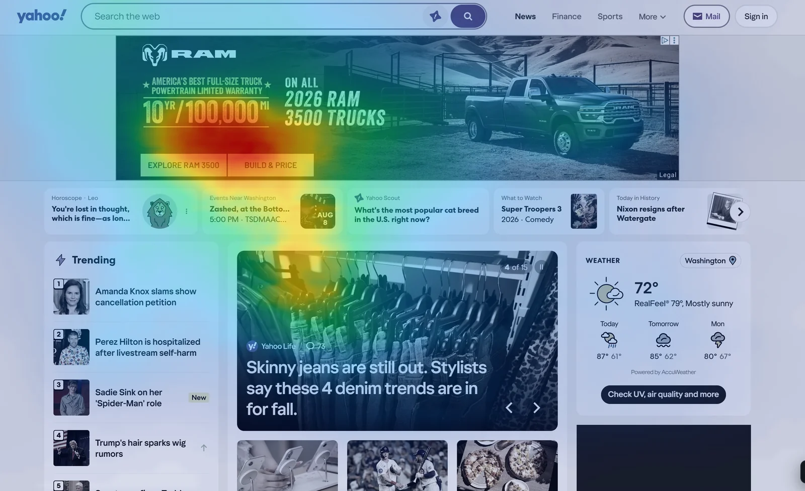
Total heat tells you where attention concentrates. The scanpath tells you the sequence, which element is predicted to catch the eye first, second, and third, and which get passed over. For most pages the order is the more useful half.
A headline can be warm and a call to action can be warm, but if the predicted path reaches the headline first and the call to action last, after several other stops, you have a sequencing problem that the heat alone hides. The eye may never arrive at the button with any intent left.
When you read a scanpath, ask whether the first predicted fixation lands on the thing you most want noticed. If your hero image wins the first look and your value proposition comes fourth, the page is leading with decoration.
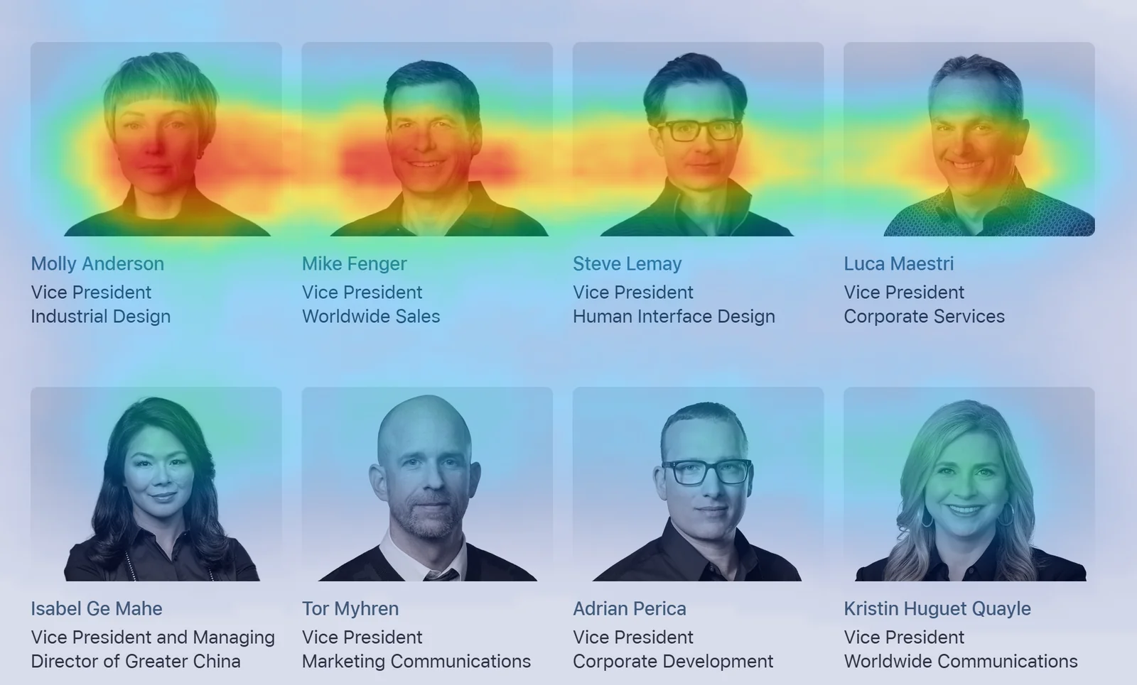
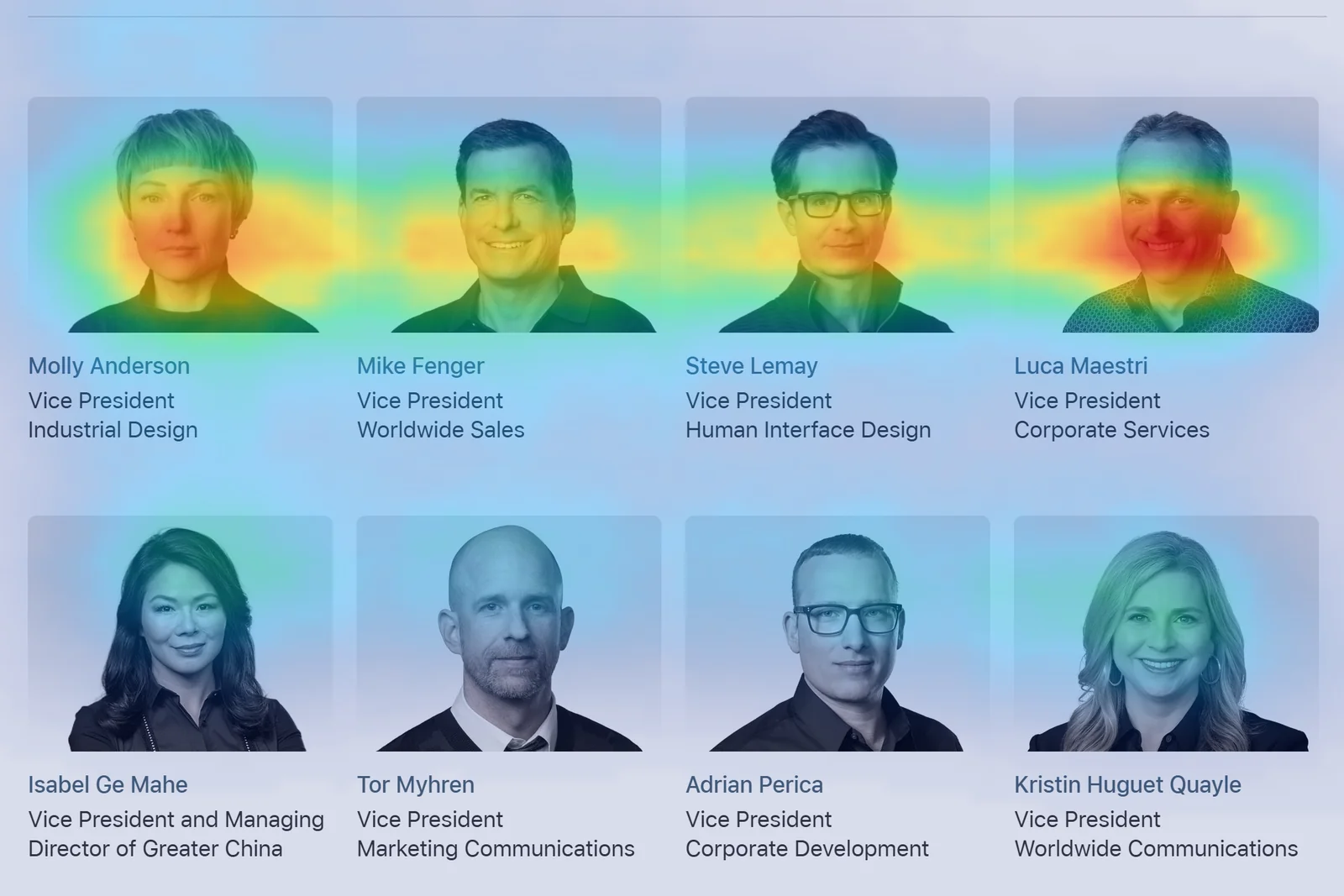
The scan also keeps running while you watch, so any single frame is one moment out of a sequence. These two are the same viewport a few seconds apart.
Read scroll depth against where your content sits
A single screen of heat only covers what is visible at one scroll position. Real pages are taller than one screen, so the useful question is how far down predicted attention still holds up, and whether your important content sits inside that range.
If a full-page report shows attention concentrated in the top quarter and thinning fast below it, and your primary call to action lives three quarters of the way down, the map just told you the two are misaligned. Usually that means moving the content that matters up into the range where attention still reaches, rather than trying to make the lower section louder.
The questions to ask of any attention map
Skip the urge to admire the picture. Interrogate it instead.
- Is the right thing hot? Find the single element the page exists to communicate. If it isn’t warm, the design is burying your point.
- Is anything important cold? Look for the value proposition, the price, the proof, the button. A cold spot on something that matters is a problem you can see before a single visitor arrives.
- Does the order lead where you want? Trace the predicted path as well as the heat. If the eye reaches a decorative element first and your offer last, people have to work to find the point, and plenty of them won’t bother.
- Is attention where you spent your effort? If a graphic you dropped in without much thought wins the map and the copy you labored over stays cool, your effort and the eye are pointed at different places.
What a heatmap doesn’t tell you
Reading one well means knowing its limits as clearly as its signals.
It doesn’t tell you intent. Attention is noticing, not wanting. A red hotspot on your headline means the eye is drawn there, not that the reader is persuaded, and definitely not that they will buy.
A predicted map also doesn’t tell you what your specific visitors did. There’s no real behavior behind it. That’s the tradeoff for being able to test before you have any traffic at all.
So treat every reading as a design question worth investigating. If the map surfaces something important, confirm the change with analytics, an A/B test, or actual user research before you bet the page on it.
Machines read hierarchy too
A page built so a human eye finds the main point fast is usually a page built so a machine can extract that point too.
The same things that pull human attention, a clear visual hierarchy, an unambiguous main element, the answer placed high instead of buried, are the things that help an AI system identify what your page is actually about. When your key content is cold on the heatmap, it’s often the same content an answer engine struggles to surface, which is the exact problem behind getting cited by AI. Clarity serves both readers at once. I made the fuller version of that argument in AEO is just SEO with new acronyms.
So a heatmap that shows your value proposition getting skipped isn’t only a conversion concern. It’s a hint that your content hierarchy is working against you on every surface where something has to find the point quickly, human or otherwise.
FAQ
Read this way, a heatmap stops being a decoration and becomes a checklist. Is the right thing hot, is anything important cold, does the order lead where you want it to. Answer those honestly and the map earns its place.
If you want to generate one for your own page, or a competitor’s, the Heatcast extension runs the prediction on your own device and hands you a full-page report to read against everything above.
Sources
- Cornia et al., “Predicting Human Eye Fixations via an LSTM-based Saliency Attentive Model,” on the saliency-prediction approach behind modern attention models.
- Jiang et al., “UEyes: Understanding Visual Saliency across User Interface Types,” CHI 2023, on how attention on interfaces differs from attention on natural images.
See what ChatGPT is really searching
SubSeed captures the hidden Google queries ChatGPT runs behind every answer and enriches them with search volume, CPC, and keyword difficulty.
Related Posts


Read this post with an assistant
This is the whole prompt each button sends. Nothing hidden in it.
Read https://gridlok.co/blog/how-to-read-an-attention-heatmap/ and give me the main points in a few sentences.
Make Gridlok a Preferred Source on Google
See Gridlok surfaced more often in your Top Stories, AI Overviews, and AI Mode. One click, applied across Google Search.